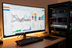
The Grafana, InfluxDB and Telegraf stack — often shortened to the TIG stack — is the standard way to collect, store and visualize metrics in a homelab. Telegraf gathers the numbers, InfluxDB stores them as time-series data, and Grafana draws the dashboards. In my setup it’s the layer that turns “the firewall feels sluggish” into a graph showing CPU climbing for three days straight as a memory leak built up.
This is the metrics layer of a home network monitoring stack. It doesn’t tell you who is talking to whom — that’s ntopng’s job — and it doesn’t tell you if a service is down right now — that’s Uptime Kuma. What it does, better than anything else at home, is keep a long, queryable history of every number that matters so you can see trends, set thresholds, and catch the slow problems before they become outages.
What Each Piece Does
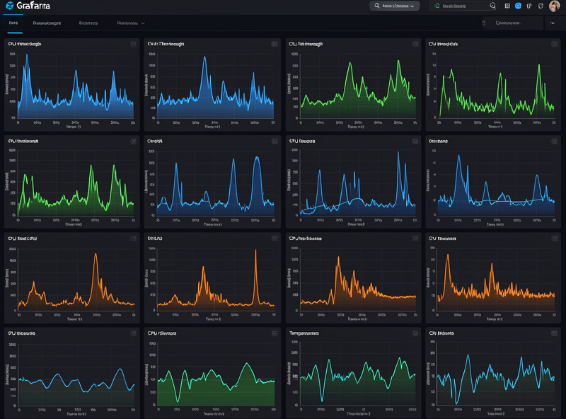
The three tools each own one job, and understanding the split is the whole battle. Telegraf is the collector: a lightweight agent with hundreds of input plugins that reads metrics from wherever they live — the system it runs on, SNMP from a switch, a ping target, an MQTT broker, a database — and writes them somewhere. InfluxDB is the store: a database built specifically for time-series data, so it ingests millions of timestamped points efficiently and answers “what was WAN latency every minute last week” without choking. Grafana is the face: it queries InfluxDB and renders dashboards, and it handles alerting on top of the stored data.
You can swap pieces — Prometheus instead of InfluxDB, a different collector — but TIG is the combination with the least friction for a home network, mostly because Telegraf’s plugin catalog already speaks to nearly every device you’d want to monitor. I already run this exact pipeline to graph my home battery state of charge over MQTT, and adding network metrics to it was a matter of turning on more Telegraf inputs, not standing up anything new.
| Component | Role | What It Handles | Resource Footprint |
|---|---|---|---|
| Telegraf | Collector / agent | Reads metrics via plugins, writes to InfluxDB | Very light |
| InfluxDB | Time-series database | Stores timestamped metrics, answers range queries | Moderate (grows with retention) |
| Grafana | Visualization + alerting | Dashboards, panels, threshold alerts | Light |
Where to Run It
On my network the whole stack runs on the Proxmox host as Docker containers on the management VLAN — one for InfluxDB, one for Grafana, and Telegraf agents wherever I’m collecting from. The footprint is modest: InfluxDB is the only piece that wants real disk, and how much depends entirely on your retention policy. I keep high-resolution data for a couple of weeks and downsample older data to a coarser interval, which keeps the database small while still letting me see months-long trends.
The one decision worth making early is retention. Storing a metric every ten seconds forever will eventually fill a disk; storing it every minute and rolling up to five-minute averages after two weeks gives you the trend visibility you actually use at a fraction of the storage. Set that up front in InfluxDB rather than discovering it when the disk fills — which, incidentally, is exactly the kind of slow problem a disk-usage panel in Grafana will warn you about if you build one.
Pulling Metrics Off the Network
For a network specifically, these are the Telegraf inputs that earn their place. The system and net inputs on the firewall and each host give you CPU, memory, load, and per-interface bytes and errors — the foundation. The SNMP input pointed at your managed switches pulls per-port counters, which is how you get the per-link picture the firewall alone can’t give you. The ping input against a reliable external host (and your own gateway) gives you WAN latency and packet loss over time, which is the single most useful network graph I keep — it turns “the internet was bad last night” into proof.
On OPNsense, Telegraf is available as a plugin, so the firewall reports its own interface and system metrics directly into InfluxDB without you installing anything by hand. That’s the anchor of the whole network dashboard: every VLAN interface, the WAN, the state-table size, and firewall CPU, all flowing into the same database as everything else. Once that’s live, a saturated uplink or a state table creeping toward its limit is a glance at a graph, not a surprise.
Building Dashboards You Actually Read
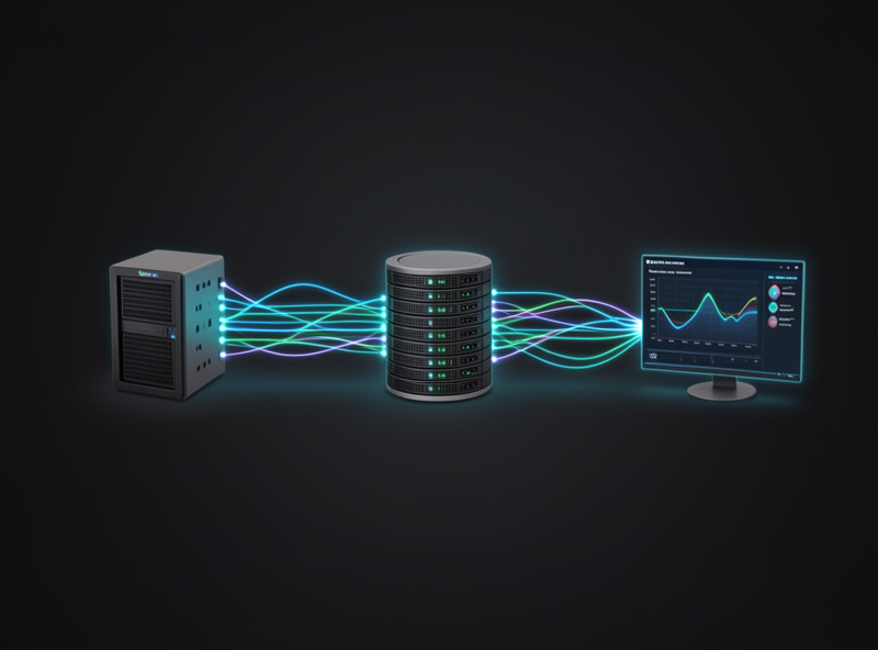
The temptation with Grafana is to build a beautiful wall of forty panels you look at once and never again. The dashboards I keep open are small and answer one question each. My main network dashboard is four panels: WAN latency and loss, per-interface throughput, firewall CPU and memory, and state-table utilization. That’s the health of the network in one screen. Everything else — per-port switch detail, NAS temperatures, per-VLAN breakdowns — lives on secondary dashboards I open when I’m investigating something specific.
Grafana’s community dashboard library is a good starting point: there are ready-made dashboards for Telegraf system metrics, SNMP, and OPNsense that you import and point at your InfluxDB, then trim down to what you care about. I start from one of those and delete two-thirds of the panels rather than building from scratch. The goal is a dashboard that answers “is the network healthy” in two seconds, not one that impresses people in screenshots.
Alerting on the Metrics
The reason to store metrics rather than just glance at live numbers is that stored history lets you alert on trends. Grafana’s alerting fires when a query crosses a threshold for a sustained period — WAN latency averaging over 100 ms for five minutes, a disk crossing 85% full, firewall CPU pinned for ten minutes. I keep these deliberately sparse, as I cover in the monitoring overview: an alert should mean something I’d act on, not every transient blip. A backup job briefly maxing a link is not an incident; a link maxed for an hour during the workday is.
This is also where TIG complements the availability layer instead of duplicating it. Uptime Kuma tells you the instant something is hard-down; Grafana tells you something is trending toward trouble while it’s still fixable. Together they cover both the cliff and the slope toward it.
Frequently Asked Questions
What is the difference between InfluxDB and Prometheus?
Both are time-series databases. InfluxDB uses a push model where Telegraf sends data to it, which pairs naturally with Telegraf’s huge plugin catalog. Prometheus uses a pull model where it scrapes targets that expose metrics. For a home network that wants to monitor varied devices like switches and a firewall, the Telegraf plus InfluxDB combination usually has less friction.
How much disk does InfluxDB need for a home network?
Far less than people fear if you set retention sensibly. Keeping high-resolution data for two weeks and downsampling older data to coarser intervals keeps a typical home network’s database to a few gigabytes. The disk usage scales with how many metrics you collect, how often, and how long you keep full resolution.
Can I monitor OPNsense with the TIG stack?
Yes, and easily. Telegraf is an OPNsense plugin, so the firewall reports its own system metrics and per-interface throughput directly into InfluxDB. That gives you WAN latency, per-VLAN traffic, state-table size, and firewall CPU on your Grafana dashboards without installing anything manually on the firewall.
Do I need to write code to build Grafana dashboards?
No. Grafana dashboards are built by adding panels and choosing queries in the web UI, and the community library has ready-made dashboards for Telegraf, SNMP and OPNsense that you import and point at your database. Most people start from an imported dashboard and trim it rather than building from scratch.
Is the TIG stack heavy to run at home?
No. Telegraf and Grafana are light, and InfluxDB is the only component that wants meaningful disk. The whole stack runs comfortably in a few containers on a modest mini PC or homelab host alongside your other services, which is why it is the default metrics stack for homelabs.
Does Grafana replace ntopng or Uptime Kuma?
No, they cover different layers. Grafana shows metric trends over time, ntopng shows who is talking to whom right now, and Uptime Kuma tells you the moment a service goes down. A complete home monitoring stack runs all three because each answers a question the others cannot.
Related Guides
- Home Network Monitoring and Observability — the stack this metrics layer fits into
- ntopng for Home Network Monitoring — the flow layer that pairs with metrics
- SNMP Monitoring at Home — feeding switch counters into Telegraf
- Monitoring Home Battery SOC with Grafana — the same pipeline for a different sensor
- Proxmox Homelab Setup — where the stack runs